Primary Research Process
To understand the real problems with the existing platform, we followed a structured primary research approach:
Affinity Mapping — All research findings were synthesised into themes, helping us prioritise the most critical problems to solve
Platform Audit — We thoroughly reviewed the existing IPDC platform, mapping every screen and interaction to identify usability gaps, inconsistencies, and missing features
Stakeholder Interviews — We spoke directly with IPDC’s internal team and key stakeholders to understand their operational pain points and business goals
User Interviews — We conducted interviews with actual platform users to understand their frustrations, expectations, and daily workflows
Competitive Analysis — We studied similar finance platforms to benchmark usability standards and identify opportunities for differentiation
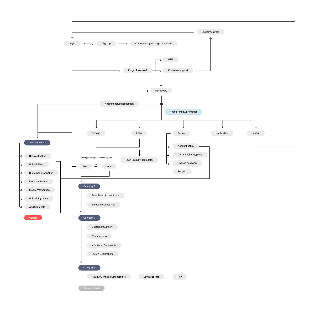
New User Journey
Based on our research findings, we restructured the entire user flow for both the user portal and admin panel. The new journey focused on reducing friction at every step.
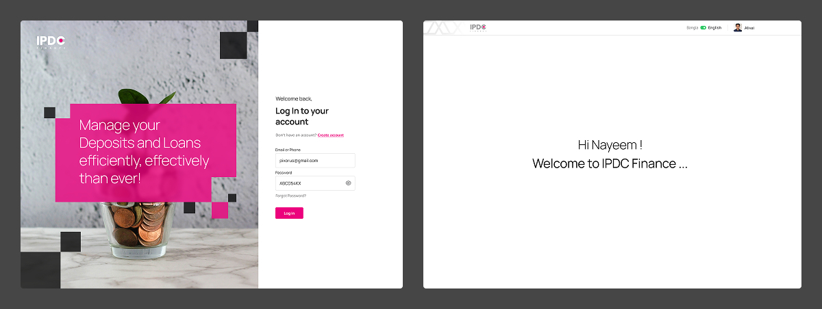
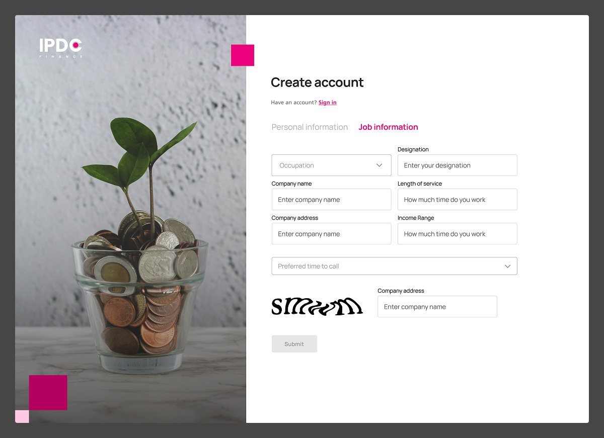
For the user platform, the flow was rebuilt around three core paths — Deposit Scheme, Loan Scheme, and Account Management — each broken into clear, manageable steps. From login and account creation through OTP verification, users could now reach their key actions in far fewer steps than before.
The onboarding flow was carefully structured into distinct categories — personal information, email and mobile verification, branch and account selection, customer summary, nominee info, and finally FATCA declarations — making a complex financial process feel simple and guided.

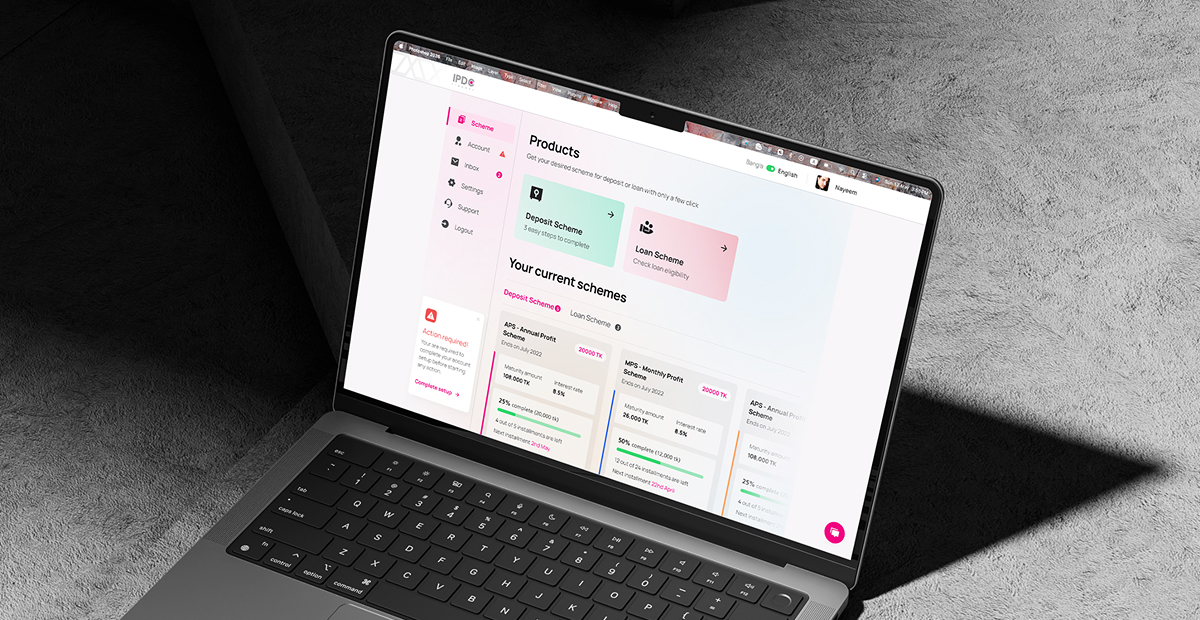
User Dashboard & Platform Design
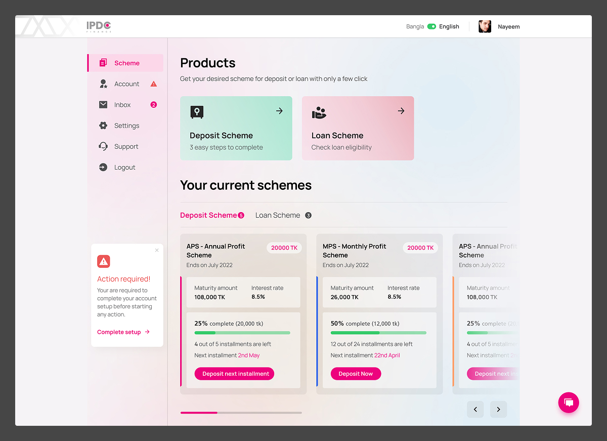
The user dashboard was designed to give customers a clear, instant overview of their financial activity. Deposit and loan schemes are displayed as individual cards — each showing the scheme name, maturity amount, interest rate, completion progress, and next installment date at a glance. Users can take direct action without digging through multiple screens.
The deposit scheme creation flow was broken into a simple step-by-step process — guiding users through personal information, nominee details, additional documents, and FATCA declarations in a structured, reassuring way. A progress indicator at the top ensured users always knew how many steps remained, reducing drop-off during onboarding.
Admin Dashboard Design
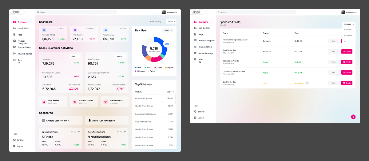
The admin panel was built for operational clarity. At a glance, administrators can monitor key platform metrics — total users, new users, customer activities, and top scheme performance — all from a single dashboard view.
Beyond analytics, the admin panel covers the full scope of platform management — from user and account oversight to sponsored post creation and push notification handling. Each section was structured so that even complex administrative tasks could be completed with confidence and minimal friction.
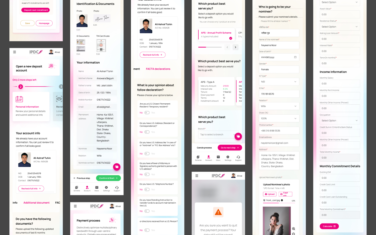
Mobile Responsive Design
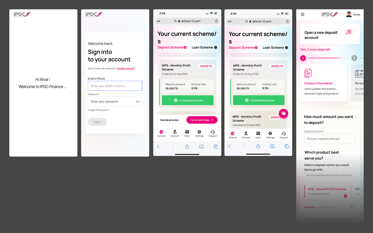
The entire platform was designed to be fully responsive — ensuring users could manage their deposits, loans, and account details seamlessly from their mobile devices.
The mobile experience maintained the same structured, step-by-step approach as the desktop version — but adapted for smaller screens with thumb-friendly interactions, simplified layouts, and clear navigation through the bottom tab bar.
Key mobile flows included the scheme overview — where users can track active deposit and loan schemes with progress and maturity details — and the new deposit account creation flow, which guided users through product selection, personal information, identification & documents, FATCA declarations, nominee details, and monthly commitment information — all broken into digestible, clearly labelled steps.
Despite the complexity of the financial data involved, the mobile design kept each screen focused and uncluttered — making even detailed processes feel approachable for everyday users.
This project was a strong reminder that even in heavily regulated, data-dense industries like finance, good design can make a real difference in how people feel about a product.
Starting from research, identifying real user pain points, and rebuilding the experience from the ground up — the result was a platform that not only looked better, but genuinely worked better for both users and administrators.
The impact was measurable: within 6 months of launch, the user bounce rate dropped by 74% — a clear signal that the new experience resonated with real users in a meaningful way.